


Analysis of Variance Simultaneous Component Analyses ASCA for CEABIGR project
This post details Analysis of Variance Simultaneous Component Analyses (ASCA) for the CEABIGR project.
Project information
The CEABIGR project repository can be found on GitHub here. In this project, we are writing a manuscript titled, “DNA methylation patterns contribute to altered gene activity in the Easter oyster”. This study investigated the impact of ocean acidification on the genetic and epigenetic mechanisms of oysters, focusing on changes in gene expression and DNA methylation patterns under elevated pCO2 conditions.
In this specific analysis, we are using RNAseq data to look for changes in alternative splicing between exposed and control oysters (Crassostrea virginica). Our hypothesis is that relative expression of each exon in some genes will change under exposure. To test this, we need an analysis that will detect patterns of relative expression across exons and identify when these patterns change between treatments. We will run this analysis for males and females separately, as done for other analyses in this project.
The script for this analysis is on GitHub here.
What is ASCA and when is it useful?
ASCA combines ANOVA with PCA approaches and can be a powerful tool for longitudinal multivariate data (e.g., time series, physical distance or location, or other categorical ordered assignments). ASCA is useful for the analysis of both fixed and random effects on high-dimensional multivariate data when other multivariate ANOVA analyses (i.e., MANOVA) are not able to include more variables than there are observations.
In our case, we want to know how gene expression (>10,000 genes) changes across exon position (5 positions) in oyster samples (n=26) across two treatments (exposed to OA or control). Therefore, we are testing for variation in our multivariate large transcriptomic data across categorical predictors of exon and treatment. We will also use sample as a random effect to account for repeated measures.
We had previously tried WGCNA analyses, but ran into difficulty because we had multiple levels of catagorical assignments. ASCA therefore seems like an appropriate and useful analysis for our application.
This analysis is commonly used for chemical data, especially in the medical field. We will apply this analysis for our gene expression data, because the core structure of the data (i.e., a count matrix) is the same. Studies often use this analysis to conduct time series analyses. Here, we are going to use exon position as our ordered catagorical variable.
This analysis could also be very useful for time series analysis of -omic data or physiological matrices when the data is highly dimensional and you want to test multivariate responses across multiple categorical predictors. The ability to include random effects is also useful because this is limited in analyses such as DEG and WGCNA approaches.
Let’s give it a try!
Packages and resources
The package we are using for this analysis is ALASCA, which is detailed in this paper and at this wiki page.
I tried a few other packages, but this one has the most functionality, great plotting functions, ease of use, and is newest.
Citation: Jarmund AH, Madssen TS and Giskeødegård GF (2022) ALASCA: An R package for longitudinal and cross-sectional analysis of multivariate data by ASCA-based methods. Front. Mol. Biosci. 9:962431. doi: 10.3389/fmolb.2022.962431
Bertinetto et al. 2020 provide an excellent description of ASCA analysis in the paper linked here.
I highly recommend reading these papers before attempting analyses.
Analysis of alternative splicing
Installation
I had some troubles with installation due to dependencies with the Rfast package. Check out this GitHub issue for the solution.
The developer recommends the following to install the package.
if (!requireNamespace("devtools", quietly = TRUE))
    install.packages("devtools")

devtools::install_github("andjar/ALASCA", ref = "main")
Methods overview
In order to characterize spurious transcription/alternative splicing, relative expression of each exon (exons 2-4) were calculated as fold change values relative to expression of exon 1 for each gene for each sample. These values were generated for males and females separately. We then used ANOVA simultaneous component analysis (ASCA) using the ALASCA package (Jarmund et al. 2022) to perform longitudinal multivariate analysis across exon position. ASCA is useful for the analysis of both fixed and random effects on high-dimensional multivariate data when other multivariate ANOVA analyses (i.e., MANOVA) are not able to include more variables than there are observations (Bertinetto et al. 2020). For this study, we conducted an ASCA analysis separately for each sex as expression ~ exon * treatment + (1|sample). Genes that were detected in all samples were included (11,270 genes in females and 12,645 genes in males). This model therefore analyzed multivariate expression as a function of the exon position, treatment, and their interaction with the sample as a random effect to account for repeated measures. Model was validated with bootstrapping with replacement for 100 iterations (Pattengale et al. 2010). We then plotted extracted principle components (PCs) that explained >1% of the variance to visualize patterns of expression across exons and patterns which are different between treatments. For each PC, we extracted the top 20 genes with the highest PC scores for functional enrichment and further analyses. For our analyses, we categorized PCs as those that either 1) show no difference in exon expression patterns between treatments and 2) those that do show differences between treatments. Gene lists were combined into these two categories for further analyses.
I will now walk through the analyses and how I interpretted the results.
Analysis
Note that I repeated all of the analyses here for females and males. The results were very similar for each sex, so I will show and describe the results for females in this notebook post. Throughout, I’ll point out any interesting results from the males that are not seen in the females.
1. Load and set up data
See the ALASCA tutorial for a guide on setting up data and initializing models. I’ll describe what we did here.
Data should generally be provided in long format, although data can be arranged in wide format and used with the wide=TRUE argument in the model.
In long format, the data needs to have columns with the column name variable and a column called value. variable is the name of each variable in your multivariate data set that is your response variable. Here, “gene” is our variable. The value column will have the numerical response value. Then, other columns in the dataset will have categorical descriptors that you would like to test in the model. Here, we have sample, treatment, and fold. In our dataset, fold represents the fold change in expression between exon1 and each subsequent exon position (e.g., fold2, fold3, fold4, etc.).
The data read in here is a matrix of fold change values for each sample for each gene.
library(tidyverse)
library(ALASCA)
females <- fread("output/72-exon-data-rfmt/female_exon_tf.csv")

str(females)

Classes ‘data.table’ and 'data.frame':	80 obs. of  13281 variables:
 $ SampleID_fold: chr  "S16F_fold2" "S16F_fold3" "S16F_fold4" "S16F_fold5" ...
 $ LOC111099029 : num  1.39 1.25 0 0 0 ...
 $ LOC111099033 : num  0.38 -0.234 -0.376 -1.027 -0.516 ...
 $ LOC111099035 : num  0.734 0.693 1.099 1.705 2.225 ...
Next, format data by adding a sample and fold change column by splitting the row names in data frame.
females <- females %>%
  mutate(fold = sapply(strsplit(as.character(SampleID_fold), "_"), function(x) x[2]))%>%
  mutate(sample = sapply(strsplit(as.character(SampleID_fold), "_"), function(x) x[1]))%>%
  select(!SampleID_fold)%>%
  select(sample, fold, everything())

str(females)

Classes ‘data.table’ and 'data.frame':	80 obs. of  13282 variables:
 $ sample      : chr  "S16F" "S16F" "S16F" "S16F" ...
 $ fold        : chr  "fold2" "fold3" "fold4" "fold5" ...
 $ LOC111099029: num  1.39 1.25 0 0 0 ...
 $ LOC111099033: num  0.38 -0.234 -0.376 -1.027 -0.516 ...
 $ LOC111099035: num  0.734 0.693 1.099 1.705 2.225 ...
 $ LOC111099036: num  -0.212 0.299 -0.463 1.905 1.668 ...
Read in metadata and add information for treatment.
meta<-read_csv("data/adult-meta.csv")

females$treatment<-meta$Treatment[match(females$sample, meta$OldSample.ID)]

females <- females %>%
  mutate(sex=c("Female"))%>%
  select(sample, fold, treatment, sex, everything())

 Classes ‘data.table’ and 'data.frame':	80 obs. of  13284 variables:
 $ sample      : chr  "S16F" "S16F" "S16F" "S16F" ...
 $ fold        : chr  "fold2" "fold3" "fold4" "fold5" ...
 $ treatment   : chr  "Control" "Control" "Control" "Control" ...
 $ sex         : chr  "Female" "Female" "Female" "Female" ...
 $ LOC111099029: num  1.39 1.25 0 0 0 ...
 $ LOC111099033: num  0.38 -0.234 -0.376 -1.027 -0.516 ...
 $ LOC111099035: num  0.734 0.693 1.099 1.705 2.225 ...
 $ LOC111099036: num  -0.212 0.299 -0.463 1.905 1.668 ...
We now have a column for sample, fold, treatment, sex, and a column for each gene. Here are the levels of each factor.
levels(as.factor(females$sample))
levels(as.factor(females$fold))
levels(as.factor(females$treatment))
levels(as.factor(females$sex))
> levels(as.factor(females$sample))
 [1] "S16F" "S19F" "S22F" "S29F" "S35F" "S36F" "S39F" "S3F"  "S41F" "S44F" "S50F" "S52F"
[13] "S53F" "S54F" "S76F" "S77F"
> levels(as.factor(females$fold))
[1] "fold2" "fold3" "fold4" "fold5" "fold6"
> levels(as.factor(females$treatment))
[1] "Control" "Exposed"
> levels(as.factor(females$sex))
[1] "Female"
Remove genes that have NA values. This keeps genes that are expressed in all samples.
females<-females %>%
    select_if(~ !any(is.na(.)))
We had 13284 columns (13280 genes) and now have 11270 after NA removal.
Finally, format with gene in a column and value in its own column to convert to long format.
long_females<-females%>%
  pivot_longer(cols=5:11274, names_to="gene", values_to="value")

str(long_females)

tibble [901,600 × 6] (S3: tbl_df/tbl/data.frame)
 $ sample   : chr [1:901600] "S16F" "S16F" "S16F" "S16F" ...
 $ fold     : chr [1:901600] "fold2" "fold2" "fold2" "fold2" ...
 $ treatment: chr [1:901600] "Control" "Control" "Control" "Control" ...
 $ sex      : chr [1:901600] "Female" "Female" "Female" "Female" ...
 $ gene     : chr [1:901600] "LOC111099029" "LOC111099035" "LOC111099036" "LOC111099040" ...
 $ value    : num [1:901600] 1.3863 0.734 -0.212 0.0234 3.0758 ...
2. Initialize ALASCA model
Again, see the ALASCA tutorial page for more examples and explanations of the model.
We will run a model with the following inputs:
- Fold (i.e., exon) and treatment are the main effects along with their interaction. Fold is a continuous, ordered catagory. Treatment is also a categorical variable.
- Sample (i.e., individual oyster) is included as random effect to account for repeated measures.
- We will boostrap the model to generate error estimates. The default setting is 1,000. I set the bootstrap iteration to 100, following recommendations from Pattengale et al. 2010.
- We will allow the model to reduce dimensions, which selects the highest explanatory values to reduce time for model to run. Given that we have >10,000 genes, we will select for dimension reduction. I ran it without and the output was the same.
long_females<-long_females%>%
  rename(variable=gene)%>% #name the gene column as "variable"
  select(!sex) #remove sex column that is not needed

res <- ALASCA(
  long_females, #dataframe
  value ~ fold * treatment + (1|sample), #set model
  n_validation_runs = 100, #bootstrap 100 times; takes about 10 min to run
  validate = TRUE, #bootstrap
  reduce_dimensions = TRUE #reduce variables to highest explanatory value
)
The output looks like this:
INFO  [2024-03-08 17:15:55] Initializing ALASCA (v1.0.15, 2024-02-07)
WARN  [2024-03-08 17:15:55] Guessing effects: `fold+fold:treatment+treatment`
INFO  [2024-03-08 17:15:55] Will use linear mixed models!
INFO  [2024-03-08 17:15:55] Will use Rfast!
WARN  [2024-03-08 17:15:55] Converting IDs to integer values
WARN  [2024-03-08 17:15:55] The `fold` column is used for stratification
WARN  [2024-03-08 17:15:55] Converting `character` columns to factors
INFO  [2024-03-08 17:15:56] Scaling data with sdall ...
INFO  [2024-03-08 17:15:56] Calculating LMM coefficients
INFO  [2024-03-08 17:15:56] Reducing the number of dimensions with PCA
INFO  [2024-03-08 17:15:57] Keeping 46 components from initial PCA, explaining 95.24 % of variation. The limit can be changed with `reduce_dimensions.limit`
INFO  [2024-03-08 17:15:57] -> Finished the reduction of dimensions!
WARN  [2024-03-08 17:15:57] Keeping 20 of 46 components. Change `max_PC` if necessary.
INFO  [2024-03-08 17:15:58] Starting validation: bootstrap
INFO  [2024-03-08 17:15:59] - Run 1 of 100
INFO  [2024-03-08 17:16:03] --- Used 4.79 seconds. Est. time remaining: 476.65 seconds
INFO  [2024-03-08 17:16:03] - Run 2 of 100
This will run for 100 iterations. This took about 10 minutes for this model.
At the end of the run, the following output will show:
INFO  [2024-03-08 17:23:03] Calculating percentiles for score and loading
INFO  [2024-03-08 17:23:25] ==== ALASCA has finished ====
INFO  [2024-03-08 17:23:25] To visualize the model, try `plot(<object>, effect = 1, component = 1, type = 'effect')`
The tutorial linked above has more information on other arguments that may be useful for other applications.
View the scree plot to see the variance explained by each principal component.
View scree plot. Plotting of the model (res) is used with the plot function. See the linked tutorial above for more information on plotting.
pdf(file="output/77-asca-exon/scree_females.pdf", width=3, height=3)
plot(res, component = seq(1,10), effect = 1, type = 'scree')
dev.off()
 Variance explained by each PC. A) PC variance explained in females; B) variance explained in males
This scree plot shows an output that is expected. The first few PCs explain most of the variance, with smaller amounts of variance explained by several PCs until reaching 0% variance explained.
For both males and females, 10 PCs were identified.
3. View model results for PCs that show no difference between treatments
First, I plotted the individual PCs.
The PCs and loading variables can be displayed using the code below. The PC can be specified with component and the effect you want to view can be viewed with effect. Here, we analyzed the effect of treatment across exons, and therefore treatment is the only effect we can view. If we had included another categorical variable as a descriptor (e.g., site, species), we could view the effects separately.
Here, I am specifying n_limit=10. This generates loading of variables (i.e., genes) that have the strongest negative and postive PC scores, generating a list of 20 total loading variables.
This plot makes a two panel plot that shows PC scores across exon and a second panel with individual gene loadings.
pdf(file="output/77-asca-exon/female_plots/PC1_females.pdf", width=8, height=4)
plot(res, effect = 1, component = 1, type = 'effect',
     n_limit=10,
     ribbon = TRUE,
     x_angle = 0, x_h_just= 0.5,
     flip_axis=TRUE,
     palette = c("gray", "darkred"),
     my_theme = theme_classic())
dev.off()
Here is what the plot looks like for PC1.
 PC1. A) PC scores across exon; B) PC scores of top gene loadings
Let’s break down this plot. In (A), we see PC scores of each exon. These scores are coordinates in which the point lies in the PC1 axis. The pattern that we see in (A) shows that multivariate gene expresion moves in a linear fashion across the PC1 space. Importantly, this does not reflect the absolute value of gene expression. In other words, the genes that have high association with PC1 do not necessarily have highest expression in exon 2 that decreases across exons. Rather, genes in this PC1 will display linear movement in expression and that could be either positive or negative. We will get to that next.
Overall, (A) shows us the alternative splicing pattern. These patterns are the same between treatments with treatments mapping closely to each other.
There is some shading on this plot that indicates the 95% confidence interval from bootstrapping. However, the error is so small for this PC it is hard to see.
In (B), we see the loadings of variables - which in our case are genes. We must know both where the samples lie relative to the principal component axes (scores) and the location of the principal component axes relative to the original axes (loadings). The direction of the loading will indicate how the variable contributes to the PC. In other words, we can use loadings to understand the expression patterns in individual genes.
In this example of PC1, we see that the loadings in (B) show the genes with the highest PC scores and some of those are positive and some of those are negative.
In PC1, genes with loading values of <0 indicate genes that increase in expression (inverse of the PC score pattern in A) across exon position whereas genes with loading values of >0 indicate genes that decrease in expression across exon position (matching the PC score pattern in A).
We then can look at the expression values across exons for these top genes to validate this.

We can see that the expression (plotted as standardized expression value from the model) across exons matches our expectation of either increasing (10 genes, those with negative PC scores) or decreasing expression (10 genes, those with positive PC scores) in a linear pattern.
We then used this same process to look at patterns in all other PCs. PCs 1-4 showed no difference between treatments, but PCs 5-6 did.
Let’s look at one more example from PC2.

This PC describes a pattern of expression in which expression was either increasing or decreasing in the middle exon positions. Genes with loading scores >0 has expression lowest in middle exons (as shown in A) and genes with loading scores <0 showed expression highest in middle exons (inverse to the pattern shown in A).
This matches expression values when plotted at the level of individual genes.

PCs 1-4 showed no difference in treatments and the patterns were the same for males and females. However, the top loading genes were different between males and females. I will include the full panel figures with male and female results below.
4. View model results for PCs that show differences between treatments
We are most interested in PCs that describe differences in alternative splicing patterns between treatments. This was seen in PCs 5 and 6 for both males and females.
We will look at PC5, which explained 6-9% of the variance. See results for PC6 below in the full panel figure.

PC5 is interesting! PC5 described genes that show either higher or lower expression of exons 2-6 relative to exon 1 depending on treatment. As described above, genes with loading scores >0 are genes with expresssion of exons 2-6 lower in treated oysters compared to high with control expression of exons 2-6 higher in treated oysters. You’ll notice that as the variance explained decreases, so do the confidence intervals. Confidence intervals for treatments do not overlap.
Importantly, this is showing relative expression of each exon as compared to exon 1. This does NOT reflect total gene expression.

PC6, which is shown below, describes genes that show differential exon expression between treatments in which either the front or end exons have higher or lower expression depending on treatment. Cool!
5. View all PC results
Now, here are the full panel results for all PCs for males and females.
Here are the PCs that describe patterns that are not affected by treatment.

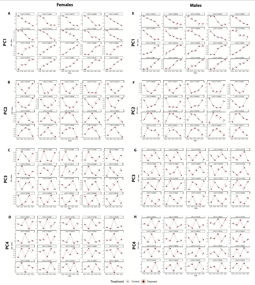
Finally, here are the PCs that describe patterns that are affected by treatment.


6. Export gene lists
After analyses, I exported the top 20 genes for each PC to a list for future functional enrichment analyses. It will be very interesting to see the functional enrichment of genes with alternative splicing between control and treated oysters.
Generate a list of genes for PC5-6.
loadings5<-get_loadings(res, component=5, effect=1, n_limit=10)
list5<-loadings5[[1]]$covars
loadings6<-get_loadings(res, component=6, effect=1, n_limit=10)
list6<-loadings6[[1]]$covars

list<-c(list5, list6)

list<-as.data.frame(list)

capture.output(list, file="output/77-asca-exon/females_splicing_treatments_gene_list.csv")
Generate a list of genes for PC1-4.
loadings1<-get_loadings(res, component=1, effect=1, n_limit=10)
list1<-loadings1[[1]]$covars
loadings2<-get_loadings(res, component=2, effect=1, n_limit=10)
list2<-loadings2[[1]]$covars
loadings3<-get_loadings(res, component=3, effect=1, n_limit=10)
list3<-loadings3[[1]]$covars
loadings4<-get_loadings(res, component=4, effect=1, n_limit=10)
list4<-loadings4[[1]]$covars

list<-c(list1, list2, list3, list4)

list<-as.data.frame(list)

capture.output(list, file="output/77-asca-exon/females_splicing_nodifference_gene_list.csv")
Summary
Overall, this analysis provided an approach to detect alternative splicing patterns and identify alternative splicing that was affected by treatment.
Some key take aways are:
- Treatment affected patters of alternative splicing
- Same patterns were discovered for males and females. Top genes in each pattern, however, were different between males and females.
- These differences account for a small amount of variation compared to alternative splicing patterns that are not affected by treatment, but may have biological implications we can examine through functional enrichment.