


WGCNA Attempt 1 for ceabigr project exon expression data
Today I played around with WGCNA analyses to look at exon expression data for the ceabigr project.
Overview
We tried using a WGCNA to capture patterns of relative expression across exons. Steven provided data averaged across all individuals that was in the form of a matrix with relative change in expression for each exon (2-6) relative to exon 1.
Here is the code I used today and example outputs.
library(BiocManager)
#BiocManager::install("WGCNA")
library(WGCNA)
#library(kableExtra)
# library(DESeq2)
# library(pheatmap)
# library(RColorBrewer)
# library(data.table)
#library(DT)
# library(Biostrings)
#library(methylKit)
library(WGCNA)
library(data.table) # for data manipulation
library(tidyverse)

knitr::opts_chunk$set(
  echo = TRUE,         # Display code chunks
  eval = TRUE,         # Evaluate code chunks
  warning = TRUE,     # Hide warnings
  message = TRUE,     # Hide messages
  fig.width = 6,       # Set plot width in inches
  fig.height = 4,      # Set plot height in inches
  fig.align = "center" # Align plots to the center
)
Read in data
#datExpr <- fread("output/68-female-exon-fold/logfc.txt")
datExpr <- fread("output/68-female-exon-fold/female_merge.txt")
rownames(datExpr) <- datExpr$GeneID
names(datExpr)
genes<-datExpr$GeneID

datExpr <- datExpr[ , -1, with = FALSE]

result_vector <- genes[!grepl("^L", genes, ignore.case = TRUE)]
genes <- genes[genes != "GeneID"]
Transpose to put “samples” or exon in rows and genes in columns. Put gene ID in row names.
datExpr <- t(datExpr)

datExpr<-as.data.frame(datExpr)

names(datExpr)<-genes

str(datExpr)

datExpr[] <- lapply(datExpr, as.numeric)

names(datExpr)<-genes
Choose a soft power.
powers = c(1:10)
sft = pickSoftThreshold(datExpr, powerVector = powers, verbose = 5)
plot(sft$fitIndices[,1], -log(sft$fitIndices[,3]), pch = 19, xlab="Soft Threshold (power)", ylab="-log10 scale free topology model fit", type="n")
text(sft$fitIndices[,1], -log(sft$fitIndices[,3]), labels=powers, cex=0.5)
abline(h = -log(0.9), col = "red")
Blockwise modules network construction
Run blockwise modules with a signed network.
picked_power = 8
temp_cor <- cor
cor <- WGCNA::cor                                             # Force it to use WGCNA cor function (fix a namespace conflict issue)
netwk <- blockwiseModules(datExpr,                         # <= input here

                          # == Adjacency Function ==
                          power = picked_power,               # <= power here
                          networkType = "signed",

                          # == Tree and Block Options ==
                          deepSplit = 2,
                          pamRespectsDendro = F,
                          # detectCutHeight = 0.75,
                          minModuleSize = 1000,
                          maxBlockSize = 10000,

                          # == Module Adjustments ==
                          mergeCutHeight = 0.05,
                          reassignThreshold = 1e-6,
                          minCoreKME = 0.5,
                          minKMEtoStay = 0.3,

                          # == TOM == Archive the run results in TOM file (saves time) but it doesn't save a file
                          saveTOMs = F,
                          saveTOMFileBase = "ER",

                          # == Output Options
                          numericLabels = T,
                          verbose = 3)

cor <- temp_cor     # Return cor function to original namespace

# Identify labels as numbers
mergedColors = netwk$colors
# Plot the dendrogram and the module colors underneath

table(mergedColors)

membership<-as.data.frame(mergedColors)

membership$gene<-rownames(membership)

names(membership)<-c("module", "gene")
Plot module eigengene level
Next plot eigengene levels
#Calculate eigengenes
MEList = moduleEigengenes(datExpr, colors = mergedColors, softPower = 8)
MEs = MEList$eigengenes

ncol(MEs) #How many modules do we have now?

table(mergedColors)
table<-as.data.frame(table(mergedColors))
table
The table shows number of genes in each module.
module no. genes
0 713
1 3076
2 2926
3 2471
4 2115
5 2031
6 1854
7 1819
8 1810
9 1774
10 1680
11 1504
12 1474
13 1313
Plot module expression across exon location.
head(MEs)
names(MEs)
Strader_MEs <- MEs
Strader_MEs$exon <- c("2", "3", "4", "5", "6")
head(Strader_MEs)
plot_MEs<-Strader_MEs%>%
  gather(., key="Module", value="Mean", ME0:ME13)
Plot module expression across exon location.
library(ggplot2)
library(tidyverse)

expression_plot<-plot_MEs%>%
  group_by(Module, exon) %>%

  ggplot(aes(x=exon, y=Mean)) +
  facet_wrap(~Module)+
  geom_hline(yintercept = 0, linetype="dashed", color = "grey")+
  geom_point() +
  geom_line(group=1)+
  #ylim(-0.5,1) +
  ylab("Mean Module Eigenegene") +
  theme_classic(); expression_plot

ggsave(plot=expression_plot, filename="output/69-wgcna/module-expression.png", width=12, height=12)

Identify modules that have only 1 instance of a gene (if we see only 1 instance, that means a gene moved between modules by treatment)
# Extract the substring before the underscore in the gene column
membership <- membership %>%
  mutate(gene_prefix = str_extract(gene, "^[^_]+"))

# Identify duplicate gene prefixes within the same module
unique_within_module <- membership %>%
  group_by(module, gene_prefix) %>%
  filter(n() == 1) %>%
  arrange(module, gene_prefix)

unique_within_module

length(unique(unique_within_module$gene_prefix))
There are 12,223 genes that are in different modules by treatment.
# Identify duplicate gene prefixes within the same module
same_within_module <- membership %>%
  group_by(module, gene_prefix) %>%
  filter(n() == 2) %>%
  arrange(module, gene_prefix)

same_within_module

length(unique(same_within_module$gene_prefix))
There are 1058 genes that are in the same module by treatment.
Number of unique genes in module 0.
test<-membership%>%
  filter(module==0)

length(unique(test$gene_prefix))
703 unique genes
Overlay plot of every individual gene expression level over the module mean
In the plot below, adjust “target_module”, and “target_module2” to include the module number you are interested in.
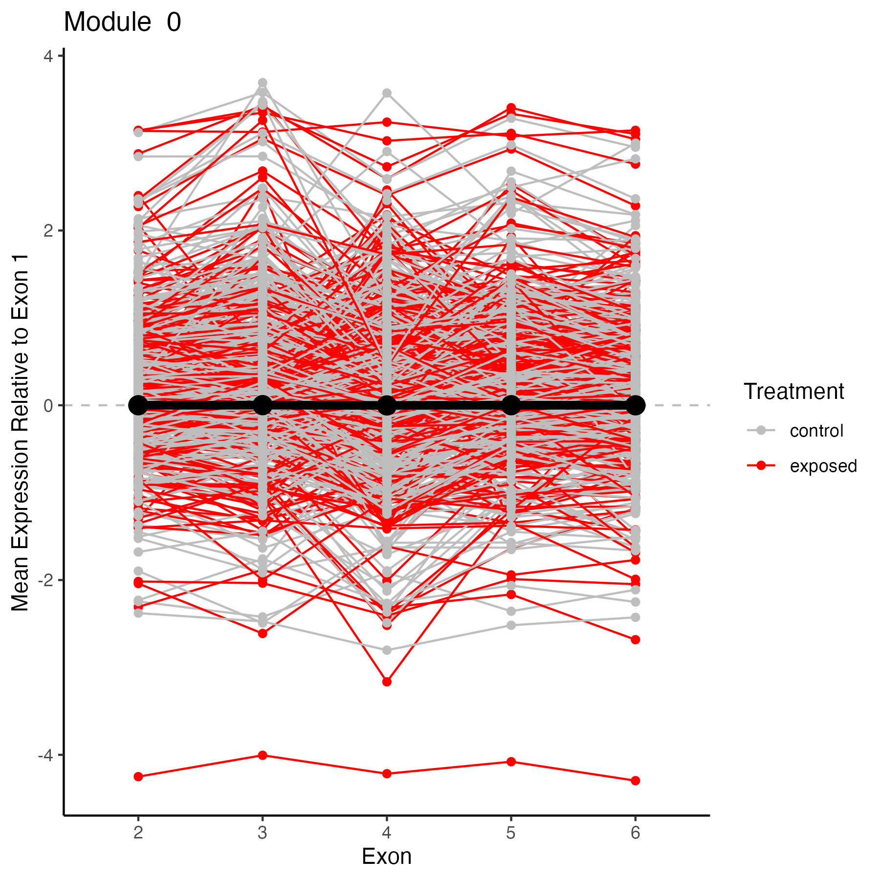
Module 0
target_module<-0
target_genes<-membership%>%filter(module==target_module)%>%select(gene)
target_genes<-unique(target_genes$gene)

# Select columns in datExpr that match any item in target_genes
selected_data <- datExpr[, colnames(datExpr) %in% target_genes, drop = FALSE]
selected_data$exon<-c("2", "3", "4", "5", "6")

selected_data<-selected_data %>%
               pivot_longer(cols = -exon,
               names_to = "gene",
               values_to = "value")%>%

  #add color for exposed vs control
  mutate(treatment = ifelse(grepl("exp", gene, ignore.case = TRUE), "exposed", "control"))

#add in mean module expression value from module dataframe
target_module2<-"ME0"
selected_module<-plot_MEs%>%
  filter(Module==target_module2)

target_plot<-ggplot() +
  ggtitle(paste("Module ", target_module))+
  geom_hline(yintercept = 0, linetype="dashed", color = "grey")+
  geom_line(data=selected_data, aes(x=exon, y=value, group=gene, color=treatment))+
  geom_point(data=selected_data, aes(x=exon, y=value, color=treatment)) +

  geom_line(data=selected_module, aes(x=exon, y=Mean, group=1), color="black", size=2)+
  geom_point(data=selected_module, aes(x=exon, y=Mean), color="black", size=4) +

  scale_color_manual(values=c("gray", "red"), name="Treatment")+

  #ylim(-5,5) +
  ylab("Mean Expression Relative to Exon 1") +
  xlab("Exon")+
  theme_classic(); target_plot

ggsave(plot=target_plot, filename="output/69-wgcna/genes-module0.png", width=6, height=6)
Module 1
target_module<-1
target_genes<-membership%>%filter(module==target_module)%>%select(gene)
target_genes<-unique(target_genes$gene)

# Select columns in datExpr that match any item in target_genes
selected_data <- datExpr[, colnames(datExpr) %in% target_genes, drop = FALSE]
selected_data$exon<-c("2", "3", "4", "5", "6")

selected_data<-selected_data %>%
               pivot_longer(cols = -exon,
               names_to = "gene",
               values_to = "value")%>%

  #add color for exposed vs control
  mutate(treatment = ifelse(grepl("exp", gene, ignore.case = TRUE), "exposed", "control"))

#add in mean module expression value from module dataframe
target_module2<-"ME1"
selected_module<-plot_MEs%>%
  filter(Module==target_module2)

target_plot<-ggplot() +
  ggtitle(paste("Module ", target_module))+
  geom_hline(yintercept = 0, linetype="dashed", color = "grey")+
  geom_line(data=selected_data, aes(x=exon, y=value, group=gene, color=treatment))+
  geom_point(data=selected_data, aes(x=exon, y=value, color=treatment)) +

  geom_line(data=selected_module, aes(x=exon, y=Mean, group=1), color="black", size=2)+
  geom_point(data=selected_module, aes(x=exon, y=Mean), color="black", size=4) +

  scale_color_manual(values=c("gray", "red"), name="Treatment")+

  #ylim(-5,5) +
  ylab("Mean Expression Relative to Exon 1") +
  xlab("Exon")+
  theme_classic(); target_plot

ggsave(plot=target_plot, filename="output/69-wgcna/genes-module1.png", width=6, height=6)

You can add any other modules here you are interested in!
View genes that change modules
Extract genes that are in module 0 in control and module NOT 0 when exposed. Look at the values for these genes colored by treatment.
control_module<-0
treatment_module<-1

interest_genes<-membership%>%
  mutate(treatment = ifelse(grepl("exp", gene, ignore.case = TRUE), "exposed", "control"))%>%
  arrange(gene_prefix)%>%
  select(module, gene_prefix, treatment)

rownames(interest_genes)<-NULL

interest_genes<-interest_genes%>%
  pivot_wider(names_from=treatment, values_from=module)%>%
  filter(control==control_module & exposed==treatment_module)

interest_genes<-interest_genes$gene_prefix
length(interest_genes)
#select columns that contain the gene prefix
selected_columns <- datExpr %>%
  select(matches(paste(interest_genes, collapse = "|")))

length(selected_columns)
#should be double the length(interest_genes) above

selected_columns$exon<-c("2", "3", "4", "5", "6")

selected_columns<-selected_columns %>%
               pivot_longer(cols = -exon,
               names_to = "gene",
               values_to = "value")%>%

  #add color for exposed vs control
  mutate(treatment = ifelse(grepl("exp", gene, ignore.case = TRUE), "exposed", "control"))

#plot expression patterns by treatment
target_plot<-ggplot(data=selected_columns, aes(color=treatment, x=exon, y=value)) +
  ggtitle(paste("Module", control_module, "to Module ", treatment_module))+
  geom_hline(yintercept = 0, linetype="dashed", color = "grey")+
  geom_line(aes(group=gene))+
  geom_point() +
  scale_color_manual(values=c("gray", "red"), name="Treatment")+
  #ylim(-5,5) +
  ylab("Mean Expression Relative to Exon 1") +
  xlab("Exon")+
  theme_classic(); target_plot

ggsave(plot=target_plot, filename="output/69-wgcna/genes-module0-module1-treatment.png", width=6, height=6)

Next read in and plot sample-level data for these genes rather than averaged data.