


Analyzing 16S Mothur Results in R
This post details analyzing relative abundance and diversity metrics in R output from mothur analysis of 16S data for the 2020 early life history Montipora capitata time series.
Prepare Data
We previously transferred out the following files from the mothur pipline described here.
This includes the following,
Bray-Curtis matrices (lt.dist file is not subsampled/rarefied; lt.ave.dist file is subsampled/rarefied):
mcap.opti_mcc.braycurtis.0.03.lt.dist
mcap.opti_mcc.braycurtis.0.03.lt.ave.dist
Taxonomy file:
mcap.taxonomy
Shared files (subsample.shared is the file with rarefied; .shared does not have subsampling):
mcap.opti_mcc.0.03.subsample.shared
mcap.opti_mcc.shared
From these files we will be comparing results from rarefying and therefore removing eggs/embryo samples with low sequences, or not conducting rarefication and keeping all samples.
I opened these files in Excel and resaved as .txt tab delimited files.
Initial visualizations
I conducted some initial visualizations in R that can be found in scripts in my GitHub here.
Today, I used the phyloseq package to run some preliminary visualizations of data obtained through the mothur pipeline. I followed tutorials on the Phyloseq wiki to gain familiarity with the program.
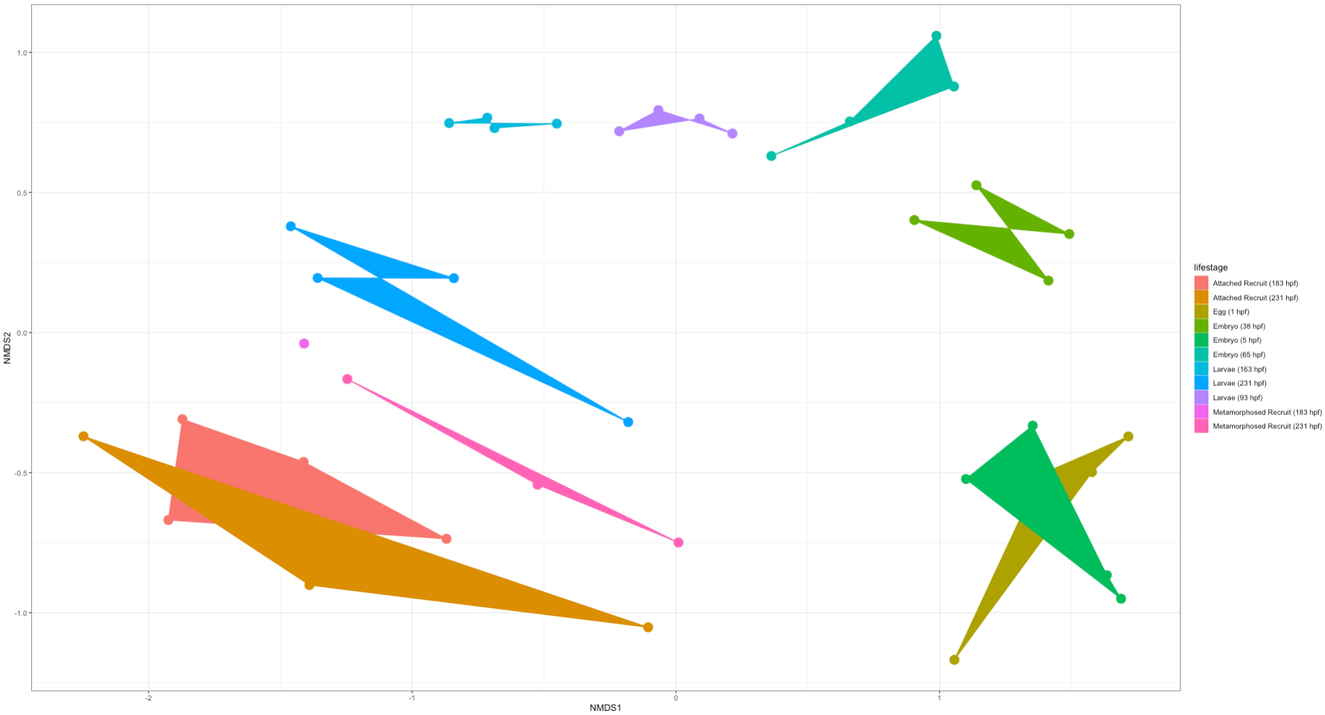
I generated NMDS plots for both the “full” dataset (no rarefication or subsampling) and the “rare” dataset (with rarefication and therefore reduction in number of samples due to some being low count).
Here is an NMDS showing lifestage groupings in the “full” dataset:
Here is an NMDS showing lifestage groupings in the “rare” dataset:
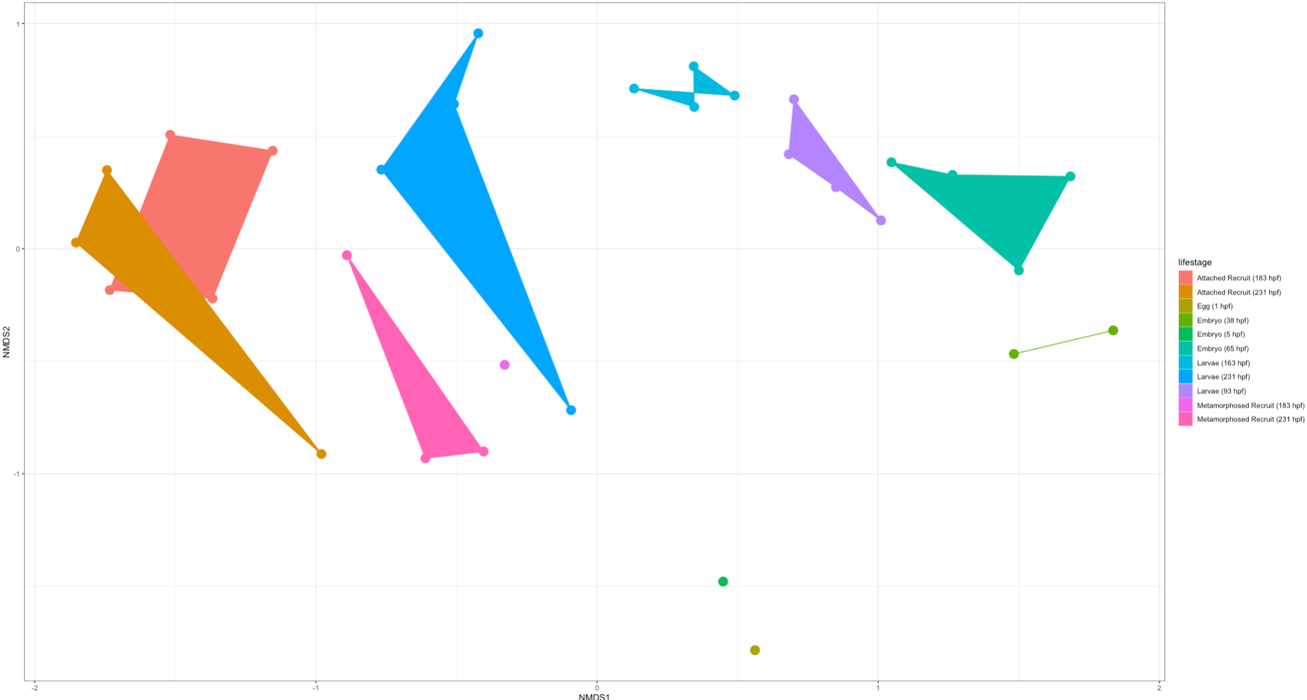
Right off the bat we notice that there is clear separation in lifestages with a gradient across development (arc from early to late stages). This is very exciting! We will likely find differences in the taxonomic and diversity analyses between these two datasets. But from this preliminary analysis we know that we do see similar groupings by lifestages.