


Integrative analysis for Montipora capitata developmental time series
This post details integrative analysis and plotting for response variables in the Montipora capitata 2020 developmental time series.
More information on this project can be found in my notebook.
Overview
For this project, we want to be able to show an integrative view of all response variables across a developmental time series. The responses we measured included:
- Respiration, photosynthesis, and P:R ratio rates
- Larval size
- Symbiont cell density
- Metabolomics
- Gene expression
- 16S bacterial communities
- ITS2 symbiont communities
Our goal is to describe shifts in the symbiotic relationship and influences on metabolism across a developmental timeseries that includes eggs, embryos, swimming larvae, metamorphosed polyps, and attached recruits.
To do this, I calculated relative change in response variables over the time series and plotted them together.
Data formatting and preparation
For each dataset, I exported a data frame that included relative change in each metric relative to the earliest point in the time series for the specific data set (eggs or embryos depending on the data set).
For metabolomic and gene expression analysis, I calculated the relative change in expression/ion counts of modules for each dataset generated through WGCNA analysis. This resulted in plotting patterns of genes or metabolites that either increased, decreased, or peaked in mid development. This is a method of data reduction for visualization. I annotated these groups with the main functional annotation features from functional enrichment analyses.
Data were loaded and formatted in long format for plotting.
Code for this workflow is on my GitHub here.
Plotting
I used the following code to plot the response metrics.
#photosynthetic capacity: cell density, photosynthesis (#f89540)
#energy demand: respiration, size (#7e03a8)
#microbiome: bacteria diversity and symbiont diversity (#f0f921)
#molecular response (#cc4778)
#metabolomic response (#0d0887)

color_keys<-c("Energy Demand"="#7e03a8", "Photosynthetic Capacity"="#f89540", "Microbiome Diversity"="darkgray", "Molecular Response"="#cc4778", "Metabolomic Response"="#0d0887")

change_plot<-df%>%

  ggplot(aes(x=lifestage, y=value, colour=category))+
  geom_smooth(aes(group=variable), alpha=0.1, se=FALSE)+
  geom_dl(label=as.factor(df$variable), method=list("last.points", cex=0.85, hjust=-0.05), inherit.aes=T)+
  geom_hline(yintercept=0, linetype="dashed", color="black", size=0.75)+
  scale_colour_manual(name="", values=color_keys)+
  scale_x_discrete(expand = expansion(add = c(0.5, 9)))+
  ylim(-6,3.75)+
  ylab("Relative Change")+
  xlab("")+
  theme_classic()+
  theme(
    legend.position="right",
    axis.text.y=element_text(color="black", size=12),
    axis.text.x=element_text(angle=45, hjust=1, color="black", size=12),
    legend.text=element_text(size=14, color="black")
  );change_plot

ggsave("Mcap2020/Figures/Integration/RelativeChange.png", change_plot, width=12, height=7, dpi=300)
The plot looks like this!
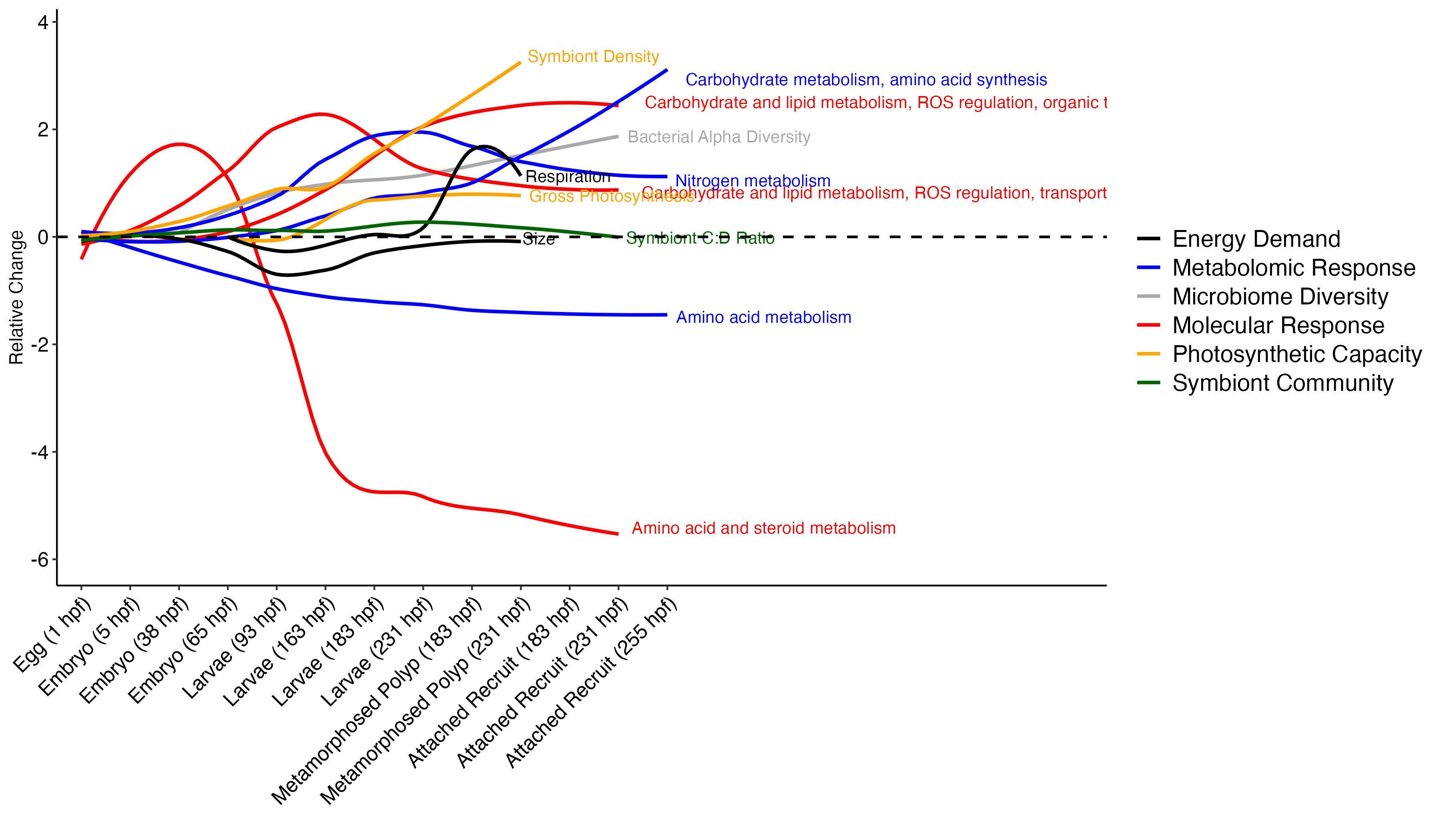
This plot is a great first step! I will manually need to move the labels so they are not overlapping and remove excess x axis lines.
Conclusions and next steps
From this plot, there are a few interesting observations:
- Amino acid metabolism decreases over time
- Symbiont diversity is stable over time, symbiont community identity stays constant
- Photosynthetic capacity increases over time, as does respiratory demand
- There are waves of molecular and metabolomic shifts. For example, there is a wave of amino acid metabolism followed by nitrogen metabolism, followed by carbohydrate metabolism from metabolomic data. Gene expression shows a wave of amino acid and steroid metabolism followed by carb and lipid metabolism and signalling and transport.
- Carbohydrate and lipid metabolism tracks increases in symbiont density and photosynthesis in particular.