


Multi-Omic Integration Analysis Part 1
This post details preliminary analyses of multi-omic datasets collected in the Montipora capitata early life history time series project.
We have 16S, metabolomic, ITS2, and gene expression data sets across 9-13 early life history developmental time points. In this analysis, we are exploring methods to integrate these datasets in order to detect holobiont shifts during development and identify key multi-omic relationships across life stages.
DIABLO framework in the mixOmics package
The package we are using for this analysis is mixOmics in R using the DIABLO scripts.
The DIABLO framework is described as:
“DIABLO is a novel mixOmics framework for the integration of multiple data sets in a supervised analysis. DIABLO stands for Data Integration Analysis for Biomarker discovery using Latent variable approaches for Omics studies. It can also be referred to as Multiblock (s)PLS-DA. DIABLO is the supervised approach with the mixOmics N-integrative framework models and allows users to integrate multiple datasets while explaining their relationship with a categorical outcome variable.”
See more information on the DIABLO framework here.
General workflow
In this preliminary approach, we are using the following general steps in our workflow:
- Load in single omic datasets such that features (e.g., metabolites, genes) are in columns and samples are in rows. Prior to loading, data sets should be normalized (e.g., VST, center normalized).
- Conduct sparse partial least squares discriminant analysis (sPLSDA) for each omic dataset to obtain the optimal number of selected features that will subsequently be used in the multi-omic analysis.
- Summarize each single omic dataset to the level of lifestage. This is the unit of comparison we are able to make since our omic datasets did not come from the same biological replicate (i.e., tube). Therefore, we will make comparisons at the life stage level.
- Conduct multi-omic block PLSDA analysis.
- Generate circos plot of strong positive correlations.
- Generate clustered image map (CIM) plot showing omic signatures of each lifestage group.
Currently, we are using gene and metabolite datasets to test this framework. In the near future, we will add in bacterial data (16S) and symbiont data (ITS2).
The scripts for this preliminary work can be found in my GitHub repository.
mixOmics provides a great tutorial and test scripts that I based my scripts from here.
There are many ways to customize this script, I will show our preliminary approach here.
Preliminary visualizations
Running single omic sPLSDA analyses indicated that 110 metabolites (out of 182 total) and 270 genes (out of 15,000+) were most informative for separation of lifestage groupings.
For example, the code for running an sPLSDA on the metabolomics data set looks like this:
X <- metabolomics[3:184]

Y <- as.factor(metabolomics$Lifestage) #select treatment names
Y

MyResult.plsda_metab <- plsda(X,Y, ncomp=9

list.keepX <- c(2:10,  seq(20, 300, 10))

set.seed(30) # for reproducbility in this vignette, otherwise increase nrepeat
tune.splsda.srbct <- tune.splsda(X, Y, ncomp = 9,
                                 validation = 'Mfold', folds=4,
                                 measure = "BER", test.keepX = list.keepX, nrepeat=20)   # we suggest nrepeat = 50

error <- tune.splsda.srbct$error.rate
ncomp.metab <- tune.splsda.srbct$choice.ncomp$ncomp # optimal number of components based on t-tests on the error rate
ncomp.metab

select.keepX.metab <- tune.splsda.srbct$choice.keepX# optimal number of variables to select
select.keepX.metab
We then used this number of features to run a block PLSDA analysis.
X <- list(genes = gene_data, # all rows are samples, columns are compounds/genes
metabolites = metabolomics)
Y <- rownames(gene_data)
summary(Y)
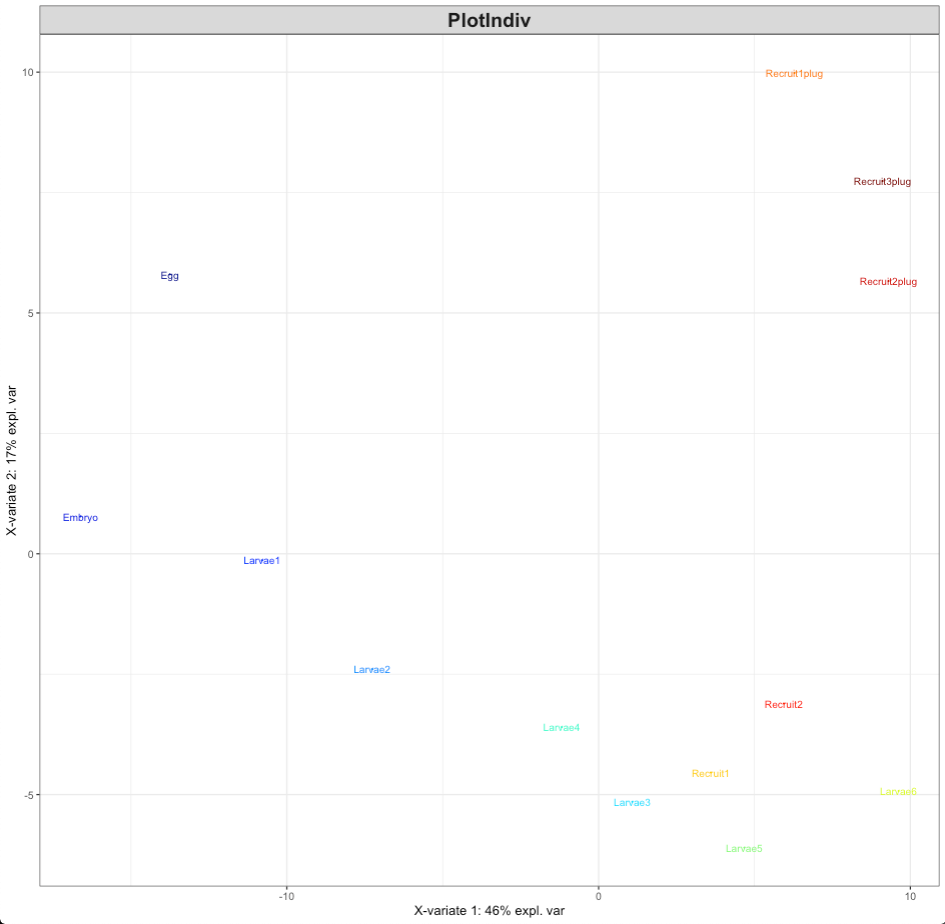
MyResult.diablo <- block.splsda(X, Y, keepX=list.keepX)
plotIndiv(MyResult.diablo)
This PLSDA visualization shows that there is clear separation of lifestages as we would expect given our previous analyses of each data set individually.
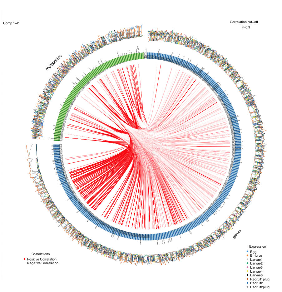
Next, I generated a circos plot. To make visualization simpler and to focus on the key interpretations, I am only showing the positive correlations (red) between genes and metabolites.
circosPlot(MyResult.diablo, cutoff=0.90, line = TRUE, showIntraLinks=FALSE, color.cor=c("red", "white"))
At a correlation cut off of 0.9 (very strong positive correlations), we get a plot like this:
If we change the correlation cut off to 0.95, we get a plot that looks like this:
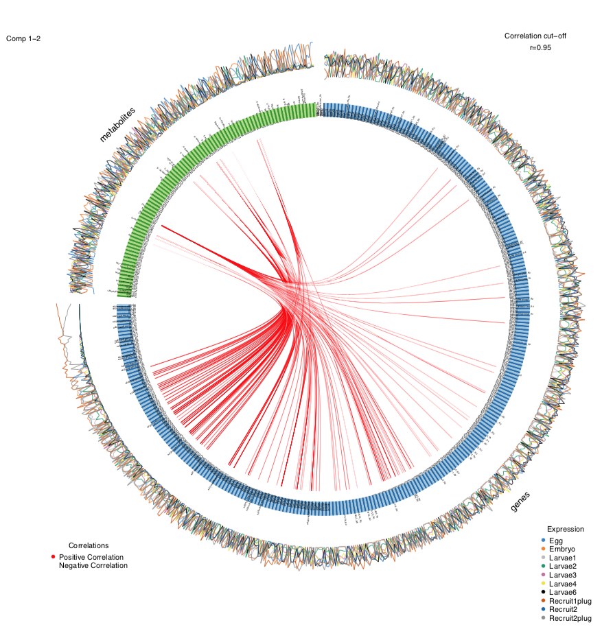
As expected, there are fewer correlations shown as a higher cut off value.
I then examined the specific correlations to look for groundtruthing and look for expected relationships between known genes and metabolites by examining the dataframe behind the circos plot.
cor_mat<-circosPlot(MyResult.diablo, cutoff=0.90)
There are several pieces of evidence that suggest we are seeing biologically meaningful relationships in this data set.
- First, we see that there are more genes connected with fewer metabolites. We would expect this given that multiple genes may influence a metabolic pathway that results in a single endpoint or intermediate metabolite.
- I also looked at specific correlations. For example, the metabolite FAD is correlated with genes involved in hydrolase enzyme activity as well as FAD-dependent methyltransferase.
- I also saw that Methionine sulfoxide is positively correlated with genes involved in extracellular structural matrix and membranes.
- Further, Acetyl CoA was positively correlated with genes involved in initiating transcription, which makes sense as Acetyl CoA can stimulate transcription.
These preliminary observations suggest that the connections seen in these analyses are biologically meaningful.
Finally, I generated a CIM plot, which allows us to look at which datasets are contributing to separation in our groups. This will become particularly more informative as we add on 16S and ITS2 datasets.
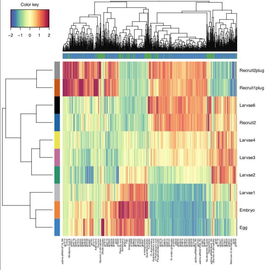
From this, we can see that eggs/embryos, larvae, and recruits cluster together as we have seen from single omic analyses previously. Once we add in our other datasets, this will help us understand which responses are correlated to these developmental time points.
Next steps
Our next step will be to add in trial data sets of 16S and ITS2 to attempt a four omic analysis.