Comparing QIIME2 and Mothur 16S QC and Filtering
This post details QC and filtering steps that were done in both Mothur and QIIME2 to compare the sequence QC results.
QC in Mothur
I followed the pipeline that I previously wrote about in a notebook post.
Order of scripts that I ran:
contigs.sh
screen.sh
unique.sh
silva_ref.sh
align.sh
screen2.sh
filter.sh
precluster.sh
chimera.sh
classify.sh
From this pipeline, 62% of sequences are kept after QC and filtering that are available for taxonomic analyses.
QC in QIIME2
I did not re run analyses in QIIME2 - I instead looked at the data outputs from my previous analyses in other notebook posts.
After denoising, filtering, and merging, 46% of input was kept.
Comparisons
In looking at the comparison information for the QC and filtering, I noticed a few things that I need to take a closer look at:
- The number of “inputs” is much higher (1.5 million) for QIIME than the number of contigs in mothur (317,000). Is this due to differences in “input” vs “contigs”?
- QIIME2 removed a much higher proportion of sequences as chimeric than mothur - why is this?
- The QC steps are done in slightly different orders, but overall we see that mothur keeps a higher proportion of the input than QIIME2. Part of this might be due to the way DADA2 removes rare sequences, whereas mothur uses error corrections to identify error and therefore keep more of the rare sequences.
Looking at taxonomic results
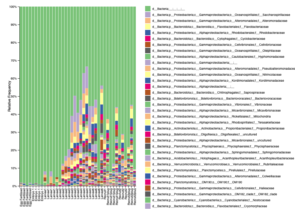
Here is what our level 5 taxonomic relative abundance plot looks like from QIIME2 (viewed as a .qzv file).

We see that we have a high proportion of unknown bacteria. Keep in mind this is relative abundance, not feature counts. QIIME2 also shows that early life stages (eggs, embryos) have lower input counts - similar to mothur.
Currently, the mothur analysis is outputing an OTU table. It would be good to go back and do this analysis for the clustering portion to ASV’s and also compare.
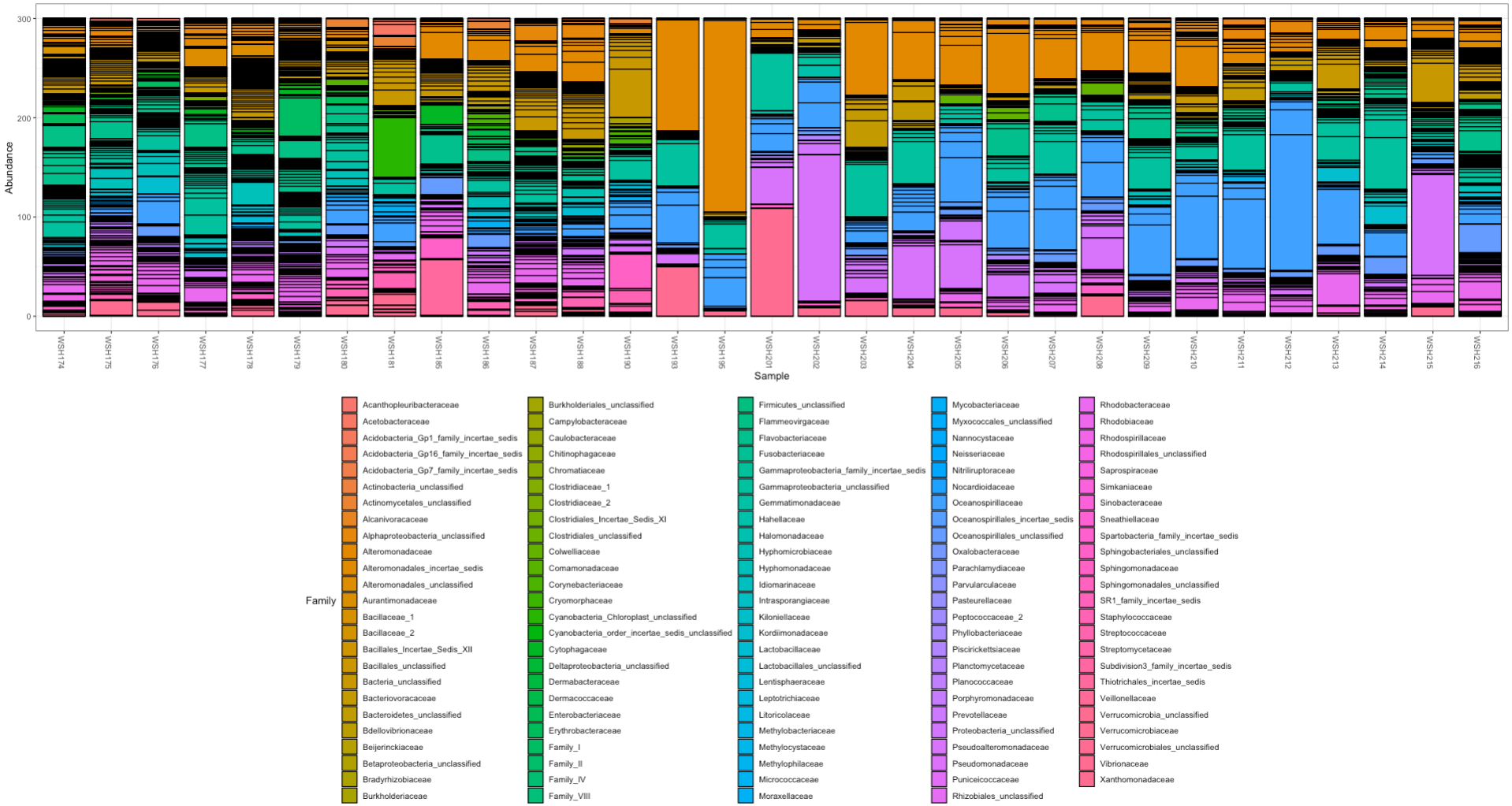
We have different results from the mothur pipeline for relative abundance where unknown bacteria do not account for such a high relative proportion:

There are more steps to do to look at these datasets, but it seems like we have some differences between pipelines. For now, mothur seems like the “best” option.


