


E5 Deep Dive RNAseq WGCNA Analysis
This post details WGCNA preliminary analysis for the E5 Deep Dive Project.
More information on this project can be found on the GitHub repo.
This analysis uses the gene count matrix produced using this workflow.
The script for this analysis is in the GitHub repo code folder.
1. Data filtering and transformation
I first loaded the data - a gene count matrix and metadata with treatment information for each colony.
#load metadata sheet with sample name and treatment information
metadata <- read.csv("A-Pver/data/rna-seq/metadata_NutrientEnrichment_Pverr_RNASeq.csv", header = TRUE, sep = ",")

#load gene count matrix generated from cluster computation
gcount <- as.data.frame(read.csv("A-Pver/data/rna-seq/Pverr_gene_count_matrix.csv", row.names="gene_id"), colClasses = double)
I then matched the NCBI SRR numbers to fragment ID.
names(gcount)<-gsub("^[^.]*\\.|_.*$", "", names(gcount)) #restructure column names

names(gcount) <- metadata$FragmentID[match(names(gcount), metadata$SRR)]
We conducted two filtering steps. First, I removed any gene that had a total count of 0 across all samples (genes that were not detected in our sequences).
nrow(gcount)
gcount<-gcount %>%
     mutate(Total = rowSums(.[, 1:32]))%>%
    filter(!Total==0)%>%
    dplyr::select(!Total)
nrow(gcount)
We had 28,111 genes in the matrix, which was filtered down to 25,172 by removing genes with row sums of 0.
Second, I filtered low count genes using PoverA. PoverA specifyies the minimum count for a proportion of samples for each gene. Here, we are using a pOverA of (0.5, 10_. This is because we have 32 samples with a minimum of n=1 sample per fragment and half in enriched and half in control treatments. Therefore, we will accept genes that are present in 16/32 = 0.5 of the samples because we may expect different expression by treatment We are further setting the minimum count of genes to 10, such that 50% of the samples must have a gene count of >10 in order for the gene to remain in the data set.
filt <- filterfun(pOverA(0.5,10))

#create filter for the counts data
gfilt <- genefilter(gcount, filt)

#identify genes to keep by count filter
gkeep <- gcount[gfilt,]

#identify genes to keep by count filter
gkeep <- gcount[gfilt,]

#identify gene lists
gn.keep <- rownames(gkeep)

#gene count data filtered in PoverA, P percent of the samples have counts over A
gcount_filt <- as.data.frame(gcount[which(rownames(gcount) %in% gn.keep),])

#How many rows do we have before and after filtering?
nrow(gcount) #Before
nrow(gcount_filt) #After
Before filtering we had 25,172 genes and after we have 20,326 genes.
The gene counts were then variance-stabilized transformed using the DESeq2 package.
gdds <- DESeqDataSetFromMatrix(countData = gcount_filt,
                              colData = metadata_ordered,
                              design = ~Treatment)

gvst <- vst(gdds, blind=FALSE)
I then conducted a PERMANOVA to test for differences in gene expression profiles between enriched and control treatments and visualized these groupings using a PCA.
Permutation test for adonis under reduced model
Terms added sequentially (first to last)
Permutation: free
Number of permutations: 999

adonis2(formula = vegan ~ Treatment, data = test, method = "eu")
          Df SumOfSqs      R2      F Pr(>F)
Treatment  1    33129 0.05258 1.6648  0.023 *
Residual  30   596977 0.94742
Total     31   630106 1.00000
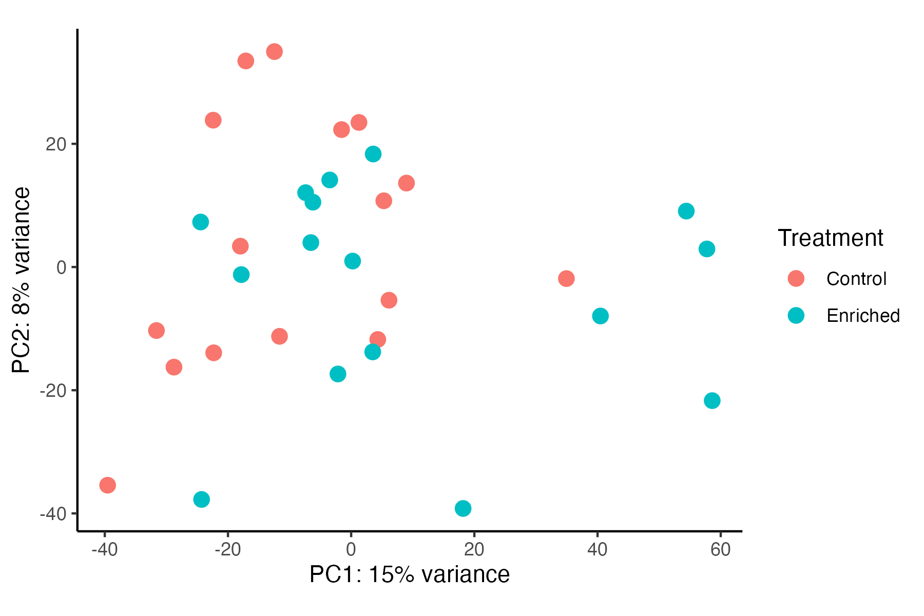
Gene expression is significantly different between Treatments (p=0.023), but these differences appear to be minimal in variance explained by treatment (5%). In contrast, Danielle’s previous results show a greater separation between treatments. Before proceeding with DEG analyses, I need to reconcille these differences and compare our approaches to generating the gene count matrix.
For example, Danielle’s PCA visualization can be found here.
We are now ready to proceed with network construction.
2. Network construction
I then constructed a correlation network using the Dynamic Tree Cut method and a signed network (to detect both positive and negative correlations).
First, I viewed a tree for all samples to see if there are particular samples as outliers.
datExpr <- as.data.frame(t(assay(gvst)))

sampleTree = hclust(dist(datExpr), method = "average");
# Plot the sample tree: Open a graphic output window of size 12 by 9 inches
# The user should change the dimensions if the window is too large or too small.
pdf("A-Pver/output/rna-seq/wgcna_outliers.pdf")
plot(sampleTree, main = "Sample clustering to detect outliers", sub="", xlab="", cex.lab = 1.5, cex.axis = 1.5, cex.main = 2)
dev.off()
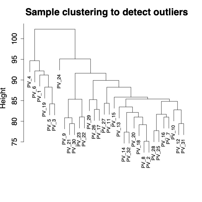
There are 6 fragments that group separately from other fragments in this dataset. I was not able to find species identifications on GitHub for these fragments. I will follow up with Danielle to see if these 6 fragments are by change P. eydouxi as compared to P. meandrina.
I selected a soft threshold power of 5 for this analysis using a scale-free topology fit of r^2=0.9. I generated a dissimilarity matrix and then detected modules using Dynamic Tree Cut method with module size set at a minimum of 30 genes. Dynamic tree cut methods uses relatedness between gene expression to detect genes with similar expression patterns.
options(stringsAsFactors = FALSE) #The following setting is important, do not omit.
enableWGCNAThreads() #Allow multi-threading within WGCNA.
#
# #Load the data saved in the first part
adjTOM <- load(file="A-Pver/output/rna-seq/datExpr.RData")
adjTOM
#
# #Run analysis
softPower=5 #Set softPower to 5
adjacency=adjacency(datExpr, power=softPower,type="signed") #Calculate adjacency

TOM= TOMsimilarity(adjacency,TOMType = "signed") #Translate adjacency into topological overlap matrix
#this step can take awhile

dissTOM= 1-TOM #Calculate dissimilarity in TOM

geneTree=flashClust(as.dist(dissTOM), method="average"

minModuleSize = 30
dynamicMods = cutreeDynamic(dendro = geneTree, distM = dissTOM,
deepSplit = TRUE, pamRespectsDendro = FALSE,
minClusterSize = minModuleSize)
Here you can see the dendrogram and module detection with modules represented in colors.
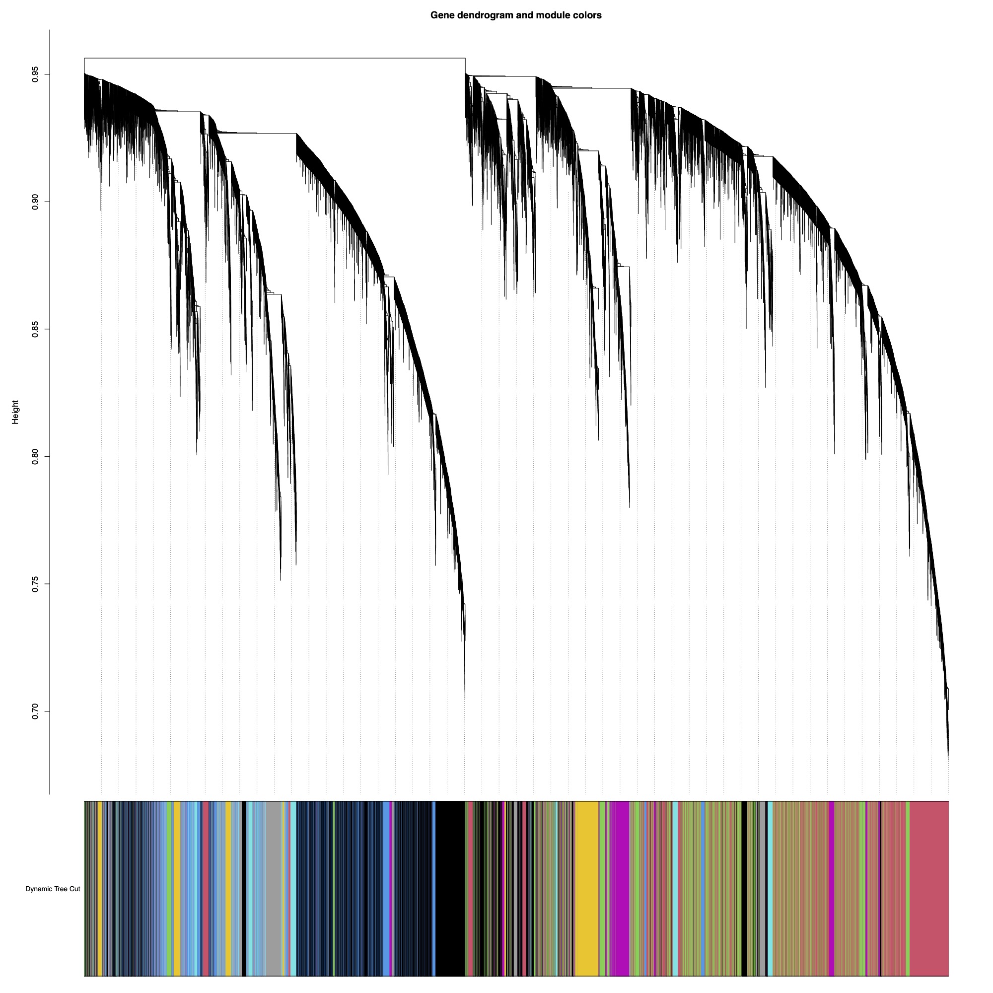
This analysis identified 59 modules. We then merged modules with >85% similarity, resulting in 43 total modules.
MEDissThres= 0.15 #merge modules that are 85% similar

merge= mergeCloseModules(datExpr, dynamicColors, cutHeight= MEDissThres, verbose =3)
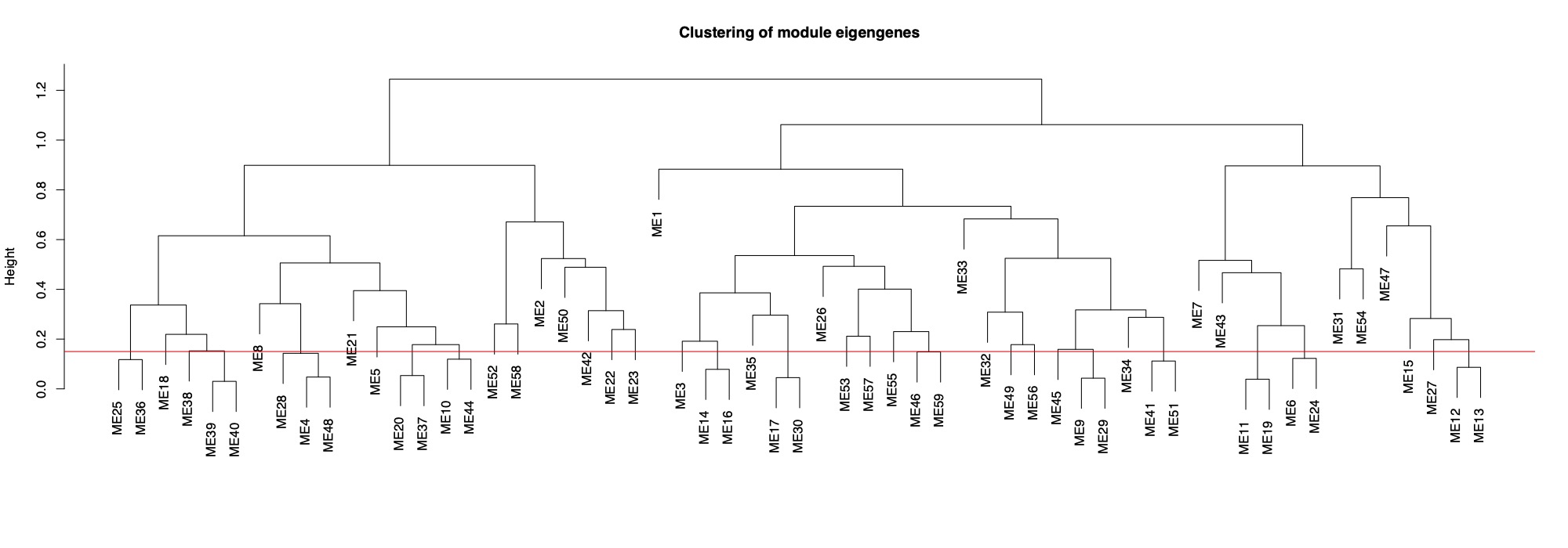
This tree shows you distance between modules. Modules with nodes below the red line will be merged (85% cutoff).
Finally, here is the dendrogram of gene expression showing the original detected modules and the merged module colors.
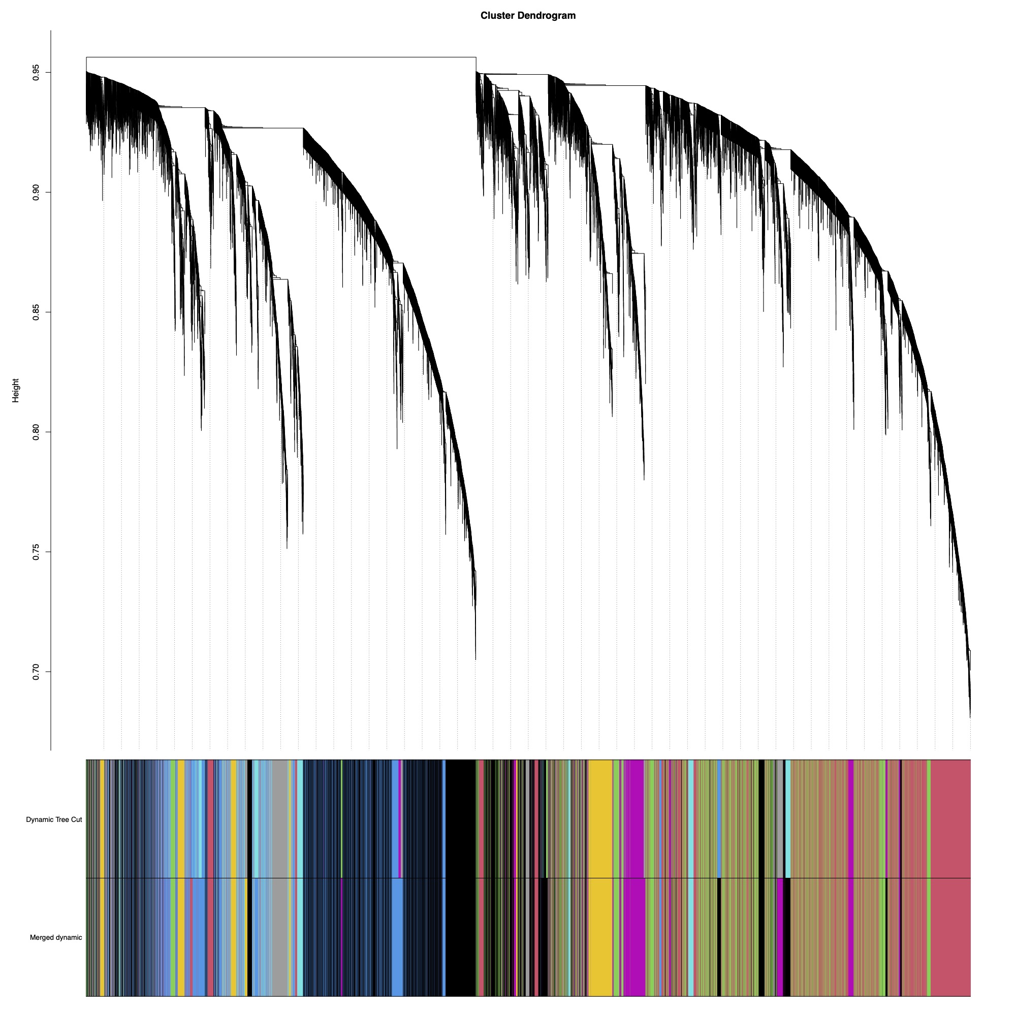
There are 43 modules of genes that we can now correlate to fragment characteristics or treatment groupings.
3. Visualizing results
Module eigengene values (essentially expression values for each module) for each fragment are then correlated against treatment or physiological variables.
Physiologicaly metrics and treatments were assembled in the datTraits dataframe and correlated against module eigengene values in the MEs dataframe.
moduleTraitCor = cor(MEs, datTraits, use = "p");
moduleTraitPvalue = corPvalueStudent(moduleTraitCor, nSamples);
Colors=sub("ME","", names(MEs))
Finally, I created a complexHeatmap with module-trait correlations.
#Create list of pvalues for eigengene correlation with specific life stages
heatmappval <- signif(moduleTraitPvalue, 1)

#Make list of heatmap row colors
htmap.colors <- names(MEs)
htmap.colors <- gsub("ME", "", htmap.colors)

treatment_order<-c("Control", "Enriched")

library(dendsort)
row_dend = dendsort(hclust(dist(moduleTraitCor)))
col_dend = dendsort(hclust(dist(t(moduleTraitCor))))

pdf(file = "A-Pver/output/rna-seq/Module-trait-relationship-heatmap.pdf", height = 16, width = 8)
Heatmap(moduleTraitCor, name = "Eigengene", row_title = "Gene Module", column_title = "Module-Lifestage Eigengene Correlation",
        col = blueWhiteRed(50),
        row_names_side = "left",
        #row_dend_side = "left",
        width = unit(5, "in"),
        height = unit(12, "in"),
        #column_dend_reorder = TRUE,
        #cluster_columns = col_dend,
        row_dend_reorder = TRUE,
        #column_split = 2,
        row_split=3,
        #column_dend_height = unit(.5, "in"),
        column_order = treatment_order,
        cluster_rows = row_dend,
        row_gap = unit(2.5, "mm"),
        border = TRUE,
        cell_fun = function(j, i, x, y, w, h, col) {
        if(heatmappval[i, j] < 0.05) {
            grid.text(sprintf("%s", heatmappval[i, j]), x, y, gp = gpar(fontsize = 10, fontface = "bold"))
        }
        else {
            grid.text(sprintf("%s", heatmappval[i, j]), x, y, gp = gpar(fontsize = 10, fontface = "plain"))
        }},
        column_names_gp =  gpar(fontsize = 12, border=FALSE),
        column_names_rot = 35,
        row_names_gp = gpar(fontsize = 12, alpha = 0.75, border = FALSE))
#draw(ht)
dev.off()
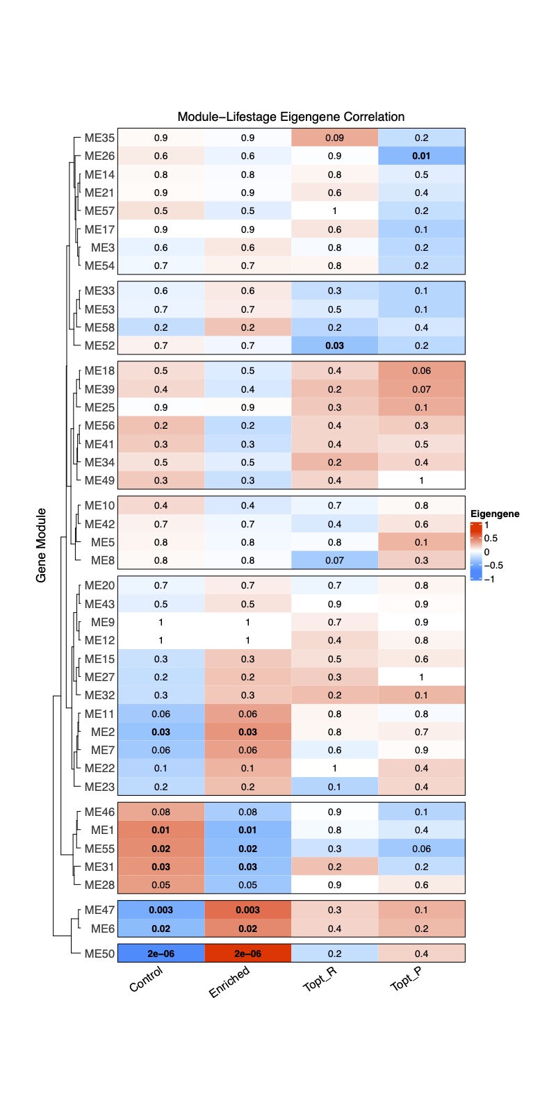
Here, I show the correlation with treatment (control or enriched) as well as two example physiological variables: Thermal Optimum for fragment respiration and the Thermal Optimum for fragment photosynthesis.
Bold text indicates significant correlation between the trait and module with blue representing a negative correlation and red indicating a positive correlation. The numbers are correlation r values. It is interesting to note that there are several modules associated with treatment, but only 1-2 associated with either physiological variable.
We will continue to add more physiological metrics in additional analysis.
4. Next steps
- Conduct DESeq2 analysis as done by Danielle Becker to confirm that we obtaining the same results as she did in previous analyses
- Run WGCNA with all available physiological metrics
- Run WGCNA of lnRNA with Zack and conduct module correlation between RNA and lcRNA modules
- Conduct functional enrichment of modules of interest